Role
- Developer
- Designer
- Strategist
- Photographer
Tags
- WordPress
- Advanced Custom Fields
- Sass
- Adobe XD
- Photoshop
- Lightroom
I was tasked with refreshing Scrapyard’s design and building their new website. With a small budget and a blank slate–we chalked our hands, strapped on our harnesses, and got to work.
Reaching new heights (and new leads)
I met Josh, Scrapyard Climbing Collective’s founder, back in 2015. We were slinging coffee together at the local coffee shop. We often talked about our dreams and one of his was climbing, but not just climbing, but a community that shared that dream. Fast forward to today and he’s got an amazing climbing gym with a close-knit community, and I picked up a lot of skills to support him.
Scrapyard Climbing Collective launched a home grown website when they were getting started. Josh was like many savvy business owners – he had his hand in everything. As his business grew, he found value in letting go of certain things so he could make sure his operation could get his full attention. We had talked throughout the evolution of his gym about what he wanted in a website, and in 2023, I was fortunate enough to design and code Scrapyard’s new website.
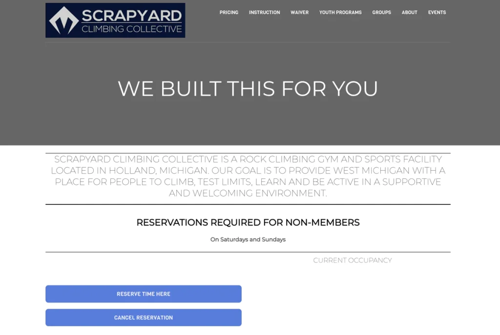
The biggest pain point of the original site was that it was messy. It was heavy on the reading and light on the imagery. Additionally, branding was non existent apart from using their “Scrapyard blue”.
Passing the vibe check™
Getting the Scrapyard team on the right foot, we had a branding workshop to determine who they thought they were and more important, who their user base thought they were. After the initial workshop, I created a mood board for the team to talk through. We had to align our words with our eyes. After determining the general direction we wanted to go, I created two stylescapes to help define the direction further. Check out this article if you haven’t created a stylescape before.
I love stylescapes. Words can only take you so far. Whenever I design from a stylescape, I find myself much more confident and efficient when designing a final product. The key factor of a stylescape is it defines the primary user and demographic. Scrapyard knew their user base more than anyone, and they knew who they wanted to attract.
We’re family friendly, but we’re not a daycare!
Scrapyard Team
The Scrapyard team loved both directions and eventually chose elements from both pieces to lead the vibe of the website design. Something very important came from this round as well with feedback from the creative. The second direction felt too “kid-friendly”, not that their gym wasn’t family oriented, but they wanted to make sure parents knew this wasn’t a day care. Pushback from clients are often taken personally, but I saw this as the most valuable piece of feedback and helped us progress through the next stages. We set up a positive feedback loop that allowed everyone to criticize the designs, including myself, when they did not align with Scrapyard’s goals. Who wants to design an entire website when it ultimately misses the mark completely? Lost time, lost effort, and in many cases, lost confidence on both sides. Having elements on display in the stylescapes took away the surprise element when reviewing the final design.
Priceless Experience
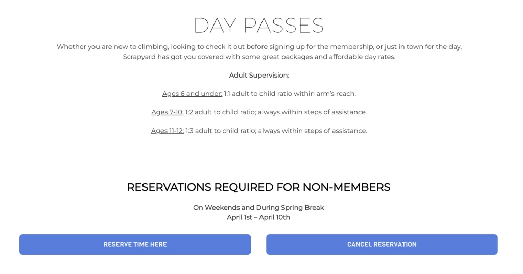
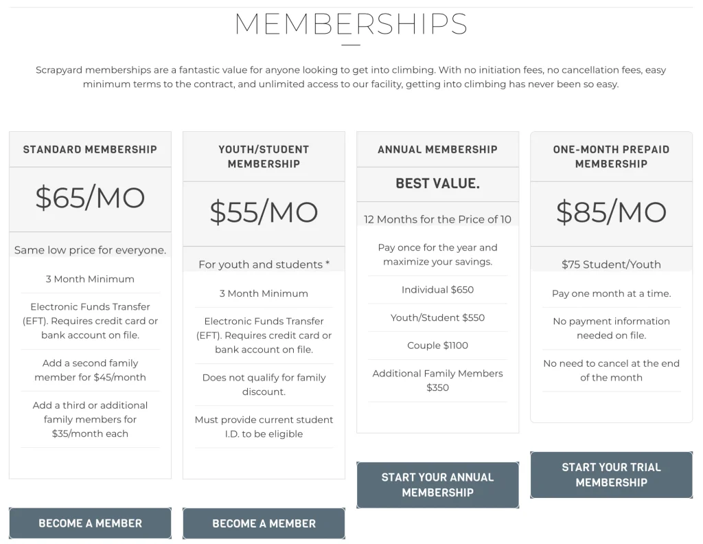
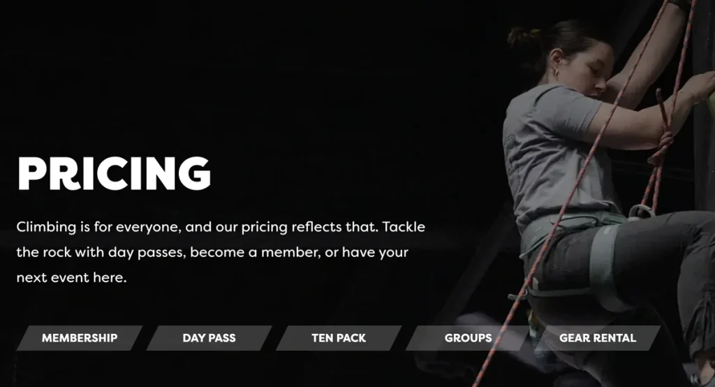
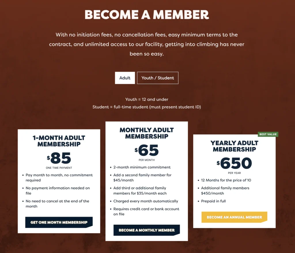
After the design was finalized, we jumped right into the UX. Being a complete website redesign with added branding to support the design, the UX conversation went as smooth as you’d expect. We identified the user’s pain points and addressed every single one. The primary user pain point aligned with the primary business goal – what is offered at the gym and how much is it going to cost? We simplified the options and made the language much more clear. Good design starts with good organization. The goal of the website was to welcome climbers of all skill levels and to be clear on pricing.
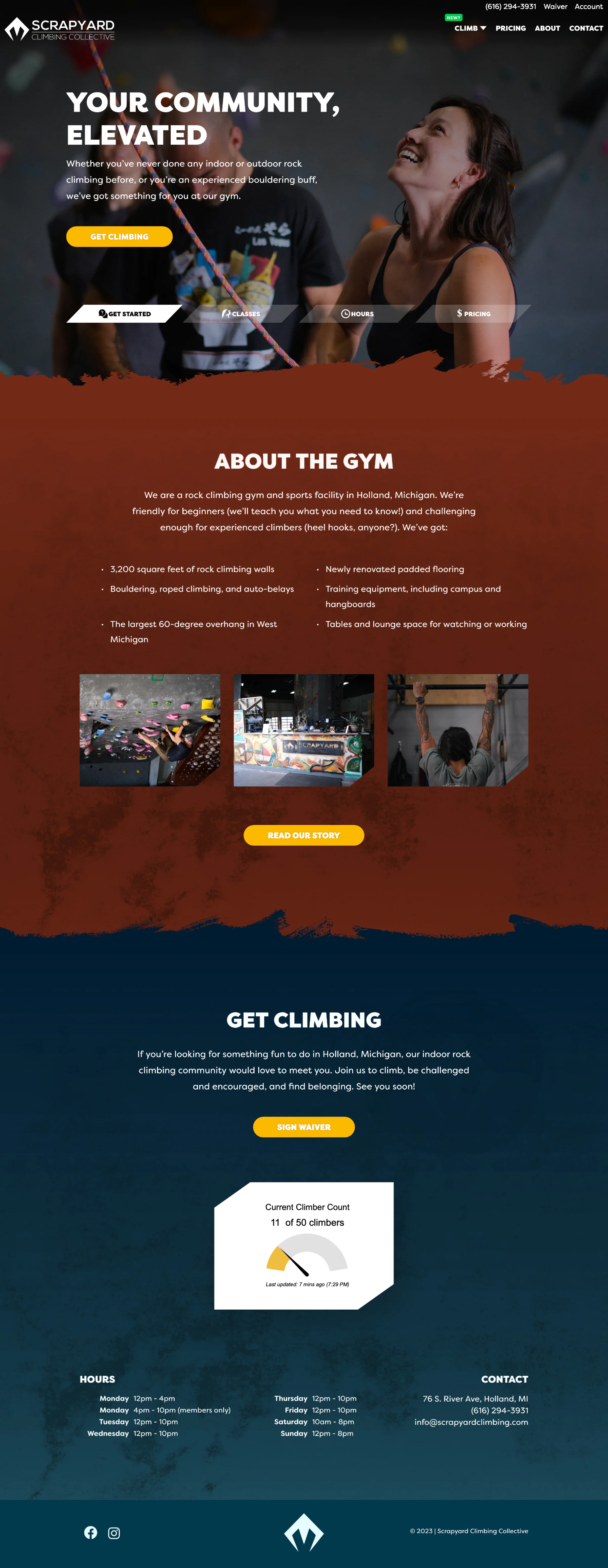
Original web design
New web design
Climbing even higher
With just a website redesign, we were able to expand Scrapyard’s identity and help set the mood for the future. Simple design motifs used throughout the site, from the typeface, to the brushstrokes that separate sections, we created something that can evolve as the business grows. Apart from the website rebuild, I was fortunate enough to capture some photos for the team to use on various social platforms or new web pages yet to be built. We accomplished a lot with a small budget, and that was all possible because of the strategy we focused on early.
The tech
Scrapyard’s original website was built with an off the shelf WordPress theme. There was not much available to customize and it was very slow to load. Additionally, managing content was confusing for the team. My agency experience allowed me to pick a stack I knew would be effective and efficient. Custom coding a theme allowed me to create an admin experience that Scrapyard would be familiar with, but supercharged specifically for them.
I started with _underscores – the best starter for efficient custom WordPress themes (in my opinion). Opting to sassify the project allowed me to use Sass to create a consistent style. This went hand in hand with Advanced Custom Fields. The combination of ACF and Sass makes a pseudo-modern component based paradigm of building. ACF also has a great “Flexible Content” block that enables page builder capabilities. Clients love designs that can be adapted to different use cases, especially if it means not having to worry about another quote to build out what is already available.
Development duration was a speedy two week process. Local development was key for efficiency and why re-invent (and manage) the wheel when Local is available. We used a few libraries to save time and budget. Highlights include the great splide.js for sliders, and the ubiquitous GSAP for animations. This has been my go-to process for small sized builds for a few years now and even for some larger sites. Since this build, I’ve transitioned to using another amazing starter for WordPress – _tw, which I just think of as _underscores with Tailwind pre-configured. While _underscores has been a staple for me for almost a decade, Tailwind reduces my build times. It’s a win-win. Plus, I’m obsessed with Tailwind.
I’m fortunate to be part of the Collective, and if you’re in West Michigan, I highly recommend stopping by their gym. Thanks to Josh and the team for allowing me to use all the skills in my tool belt to get this project completed.
Visit the full site here.